MUSSINO CO. DESIGNS
Explore my design portfolio, featuring a diverse range of projects that showcase my creative versatility. Highlights include a class project showcasing galleries at the Metropolitan Museum and the Museum of Modern Art, costume designs for Dare 2 Dance, innovative logo designs and redesigns, and much more. Each project reflects my passion for design and storytelling—dive in and discover!
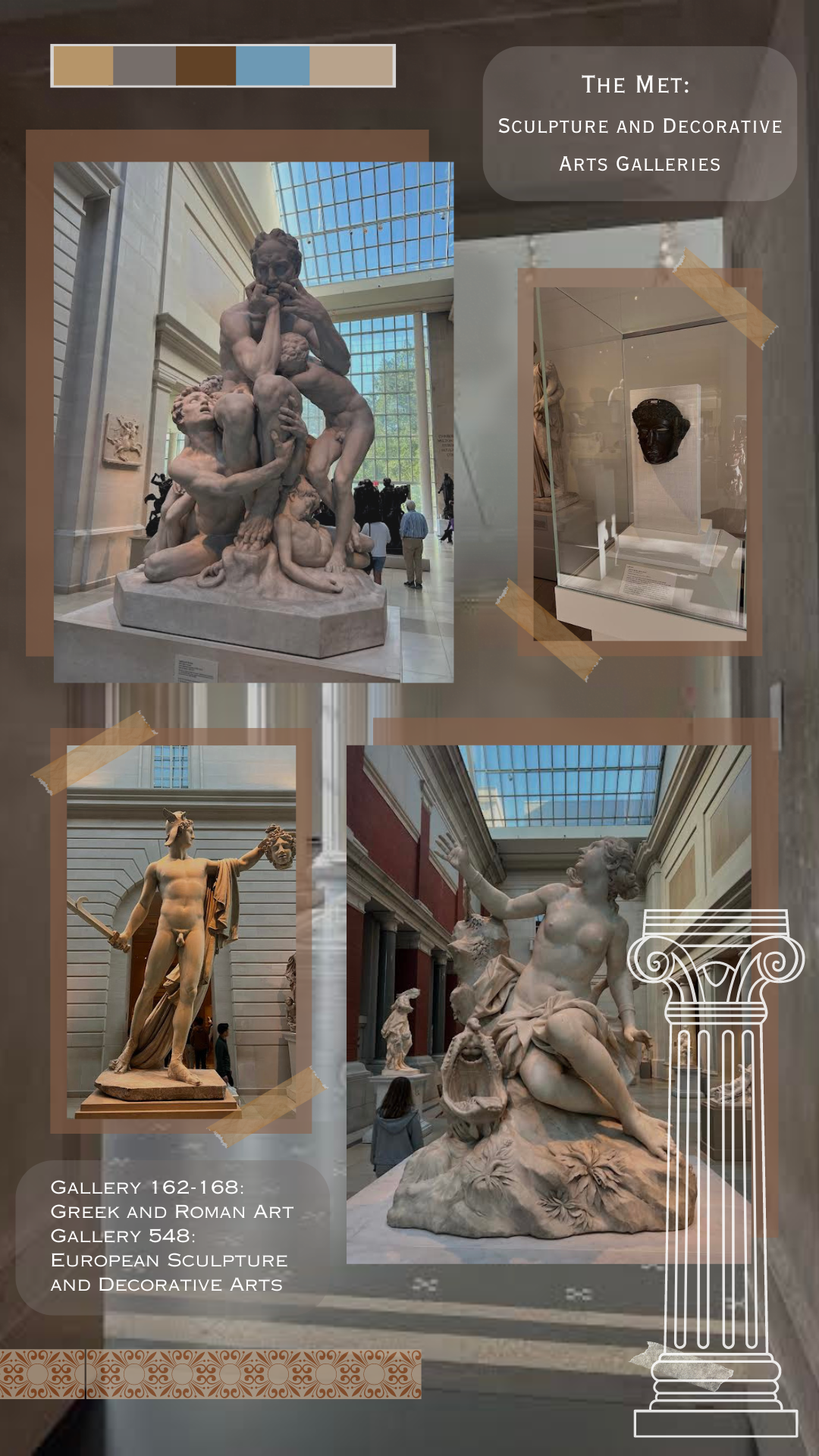
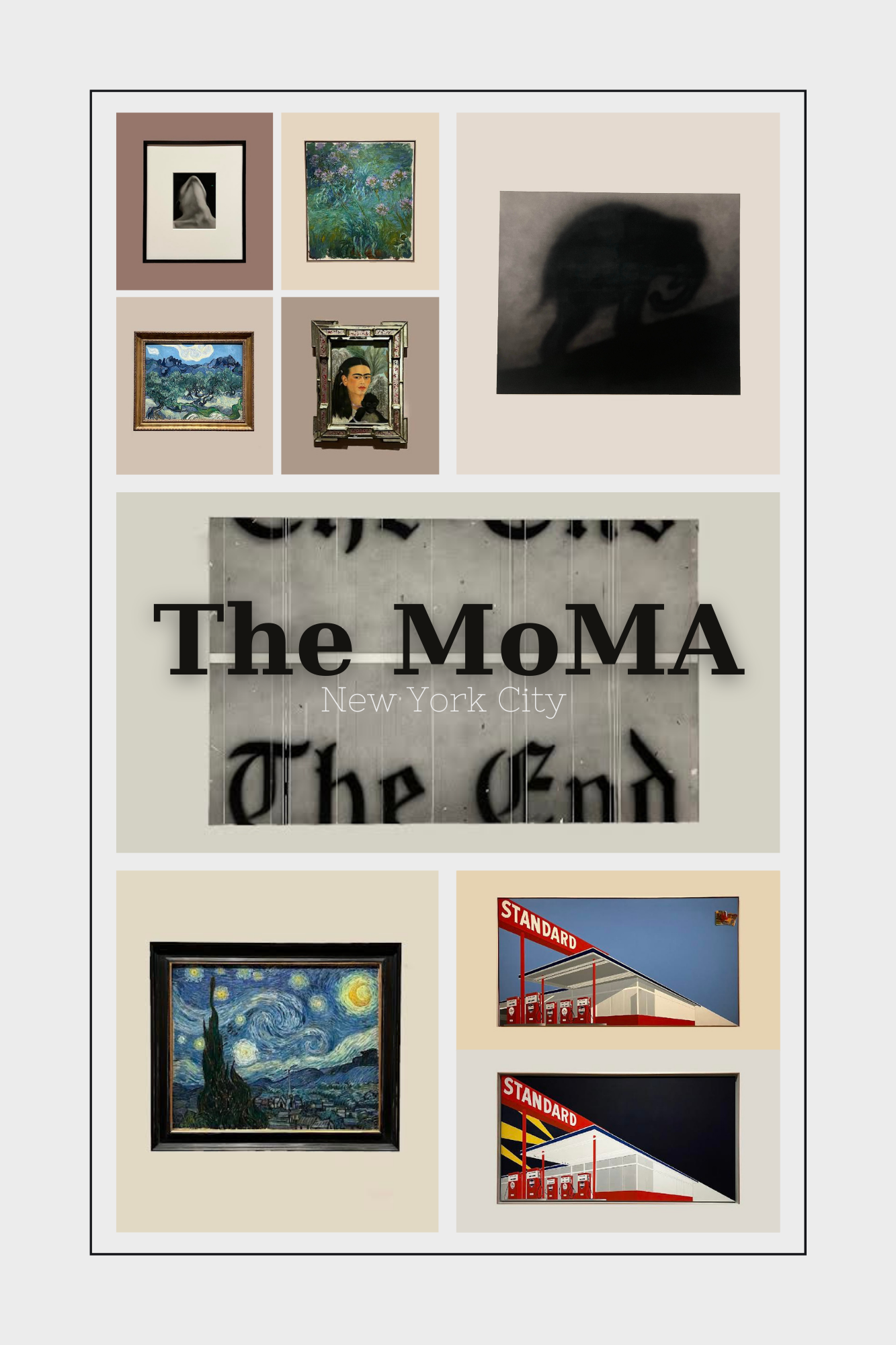
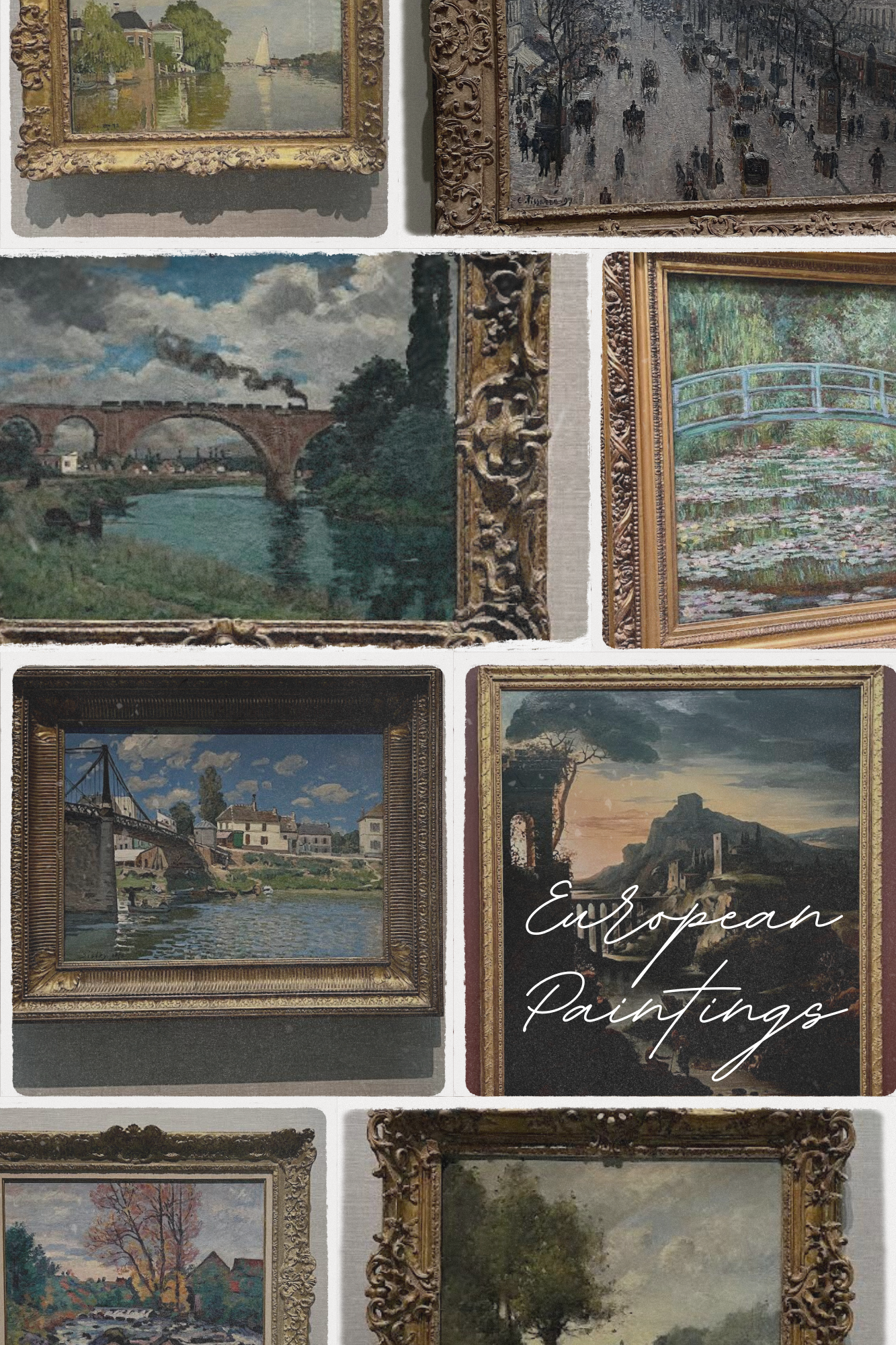
Below are my photo essays for my American History’s Final Paper Project. I decided to use very straight lines and simple neutral coloring for the layout of the MoMA because when I went, the setup exemplified a simple setting with the artwork being the only thing the viewer’s eyes are drawn to. This contrasts with the Met’s sculpture galleries, as my eyes were taken to the setting, the infrastructure of the building, as well as the art itself. With the Met’s European Paintings gallery, I wanted to create a layout that puts emphasis on the timelessness of it. In addition, I created something that would represent the plethora of art in the gallery, and the feeling of being almost overwhelmed by how much there is, and despite how much you see, you will never see it in full.
Reflection on the Art World: Reflexive Essay
The diversity within the Metropolitan Museum and the Museum of Modern Art is evident within the walls of each. Recognizing the significant differences, I found it necessary to divide the Met into two distinct entities due to the fact that they heavily contrasted from each other. My exploration of the Met's sculpture galleries, the Met European Painting Gallery, and the MoMA offered me an experience through various artistic approaches, periods, and art forms.
The Met: Sculpture Galleries:
The first of the three institutions that I visited was the Met’s Sculpture and Decorative Arts gallery. Upon walking through the galleries, I immediately noticed a rich sense of history. In addition to the pieces alone being a representation of history and the evolution of the art world, I felt transported in time through the placement and context of the art in the museum. The architecture’s classical design reinforced this, as the galleries presented the art while maintaining the culture and history. A primary way that they did this was splitting the pieces into subcategories using timeline and relation to location that they were created. The tall ceilings created an open atmosphere that suggested the eye to move upward, commanding attention to more than just what was at eye-level. There also was major usage in coloring of the gallery which helped define and compliment the intricacy of the sculptures themselves. This contrasts to many other museum’s that I have been to that have displayed sculptures in a stale way that discourage a viewer to truly be interested in the story of the scene, and what mood it curated in effect. Overall, I felt a sense of immersion in these galleries. I could easily walk up to the pieces and get close enough to observe every detail of the art making it feel real and truthful. In addition, the walls and architecture matching the time made me feel like I wasn’t only looking through a lens when observing an art piece, but I was instead immersed in the world that the artist was trying to communicate.
The Met: European Painting Galleries:
The galleries in the Met that display European Paintings present a substantial contrast to the sculpture galleries. The space instead represents intimate rooms with a deep emphasis on connecting to individual paintings. The arrangement shows them on plain, light colored walls that accentuate the paintings themselves and draw the viewer's eye onto them. The architecture is minimalistic, drawing attention to the artwork, and only the artwork. The artwork is placed primarily at eye-level, making it easy for a viewer to connect to the work. In comparison to the prior galleries, the European Paintings gallery provides a historical narrative of the art on display separated into subcategories for different artistic time periods. I had the ability to interact with the various pieces in an intimate, self-driven way. This type of engagement contrasts to the sculpture gallery, however both in my opinion allowed an immersion to the pieces in unique ways.
The Museum of Modern Art:
The final institution I went to was the Museum of Modern Art. I decided to keep the MoMA as one category because I felt like in contrast to the Met, all of the galleries held a relatively similar approach. This cohesion made it easy to pinpoint the layout and setting of the pieces. It also made it more predictable to detect my mood that came as a result of viewing the pieces. In honor of the name “Museum of Modern Art,” the building and setup of the artwork represented a modern proposal. The MoMA embraces a minimalist architectural approach by simplifying the experience when viewing the art and making it very intimate to the viewer and individual art. The atmosphere is vibrant which adds to the modern aspect. The museum felt more interactive than the Met. While the exhibits and galleries in the Met feel timeless and permanent, the MoMA has a sense of movement, as if it constantly changes to the time. This would make sense for this museum as it has the purpose of sticking to a “contemporary” feel. The exhibits give a hands-on approach and make the museum as a whole not feel as formal as the galleries of the Met.
Conclusion:
The Met sculpture galleries, the Met European Painting Gallery, and The Museum of Modern Art each offer distinct experiences for a viewer to the art world. The Met’s overall focus is on a themed and immersive approach that affects a viewers mood as well as adds a historical overview, while the MoMA strays from traditionality, instead focusing on movement and modernizing the way a viewer can relate to art. All three of the institutions I visited emphasize a viewer’s connection with the art- just in differing ways.
